01 Aug, 2020
4) Add
5) Add
6) Finally, Add
How To Create A Floating Action Button Using Material UI In React
S
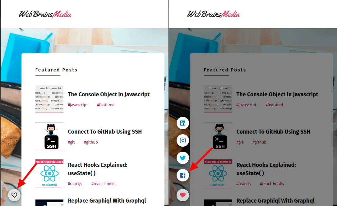
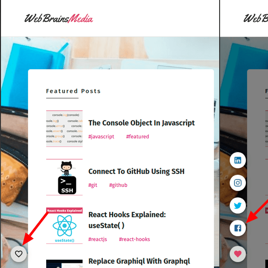
Recently, I added the FAB Button present at the bottom left position, providing links to my social accounts and i am very happy with the final result. I used Material UI for this and damn it is so easy and awesome. In this article i am going to describe all the steps that i took to create this beautiful FAB button.
Steps:
1) Install Dependencies
Run the below command to install all the dependencies.
yarn add @material-ui/core @material-ui/icons @material-ui/lab2) Create A New Functional Component
-----------------------------------------
||src/components/social-tray/social.tsx||
-----------------------------------------

import React from 'react';

export default function SpeedDialTooltipOpen() {
  return (
    <div>hello</div>
  )
}
3) Create Material UI Styles For The FAB Button
-----------------------------------------
||src/components/social-tray/social.tsx||
-----------------------------------------

import React from 'react';
import { makeStyles, createStyles, Theme } from '@material-ui/core/styles';
const useStyles = makeStyles((theme: Theme) =>  createStyles({    backdrop: {      zIndex: 1,      color: '#fff',    },    root: {      height: 0,      flexGrow: 1,    },    speedDial: {      position: 'fixed',      bottom: theme.spacing(2),      left: theme.spacing(2),    },  }));
export default function SpeedDialTooltipOpen() {
  const classes = useStyles();  return (
    <div>hello</div>
  )
}
4) Add SpeedDial Material UI Component
-----------------------------------------
||src/components/social-tray/social.tsx||
-----------------------------------------

import React from 'react';
import { makeStyles, createStyles, Theme } from '@material-ui/core/styles';
import SpeedDial from '@material-ui/lab/SpeedDial';import FavoriteIcon from '@material-ui/icons/Favorite';import FavoriteBorderIcon from '@material-ui/icons/FavoriteBorder';
const useStyles = makeStyles((theme: Theme) =>
  createStyles({
    backdrop: {
      zIndex: 1,
      color: '#fff',
    },
    root: {
      height: 0,
      flexGrow: 1,
    },
    speedDial: {
      position: 'fixed',
      bottom: theme.spacing(2),
      left: theme.spacing(2),
    },
  })
);

export default function SpeedDialTooltipOpen() {
  const classes = useStyles();
  const [open, setOpen] = React.useState(false);  const [icon, setIcon] = React.useState(<FavoriteBorderIcon />);
  const handleOpen = () => {    setOpen(true);    setIcon(<FavoriteIcon style={{ fill: '#d24769' }} />);  };
  const handleClose = () => {    setOpen(false);    setIcon(<FavoriteBorderIcon />);  };
  return (
    <div className={classes.root}>      <SpeedDial        ariaLabel="SpeedDial tooltip example"        className={classes.speedDial}        icon={icon}        onClose={handleClose}        onOpen={handleOpen}        open={open}        FabProps={{          color: 'default',          size: 'small',        }}      />    </div>  )
}
5) Add SpeedDialAction Material UI Component
-----------------------------------------
||src/components/social-tray/social.tsx||
-----------------------------------------

import React from 'react';
import { makeStyles, createStyles, Theme } from '@material-ui/core/styles';
import SpeedDial from '@material-ui/lab/SpeedDial';
import SpeedDialAction from '@material-ui/lab/SpeedDialAction';import FavoriteIcon from '@material-ui/icons/Favorite';
import FavoriteBorderIcon from '@material-ui/icons/FavoriteBorder';
import FacebookIcon from '@material-ui/icons/Facebook';import TwitterIcon from '@material-ui/icons/Twitter';import InstagramIcon from '@material-ui/icons/Instagram';import LinkedInIcon from '@material-ui/icons/LinkedIn';
const useStyles = makeStyles((theme: Theme) =>
  createStyles({
    backdrop: {
      zIndex: 1,
      color: '#fff',
    },
    root: {
      height: 0,
      flexGrow: 1,
    },
    speedDial: {
      position: 'fixed',
      bottom: theme.spacing(2),
      left: theme.spacing(2),
    },
  })
);

export default function SpeedDialTooltipOpen() {
  const classes = useStyles();
  const [open, setOpen] = React.useState(false);
  const [icon, setIcon] = React.useState(<FavoriteBorderIcon />);

  const SocialLinks: any = {    Facebook: 'https://www.facebook.com/webbrainsmedia',    Instagram: 'https://www.instagram.com/webbrainsmedia/',    Twitter: 'https://twitter.com/jainsanmati846',    LinkedIn: 'https://www.linkedin.com/in/sjcodebook/',  };
  const actions = [    {      icon: (        <FacebookIcon          style={{ fill: '#3b5998' }}          onClick={() => handleClick('Facebook')}        />      ),      name: 'Facebook',    },    {      icon: (        <TwitterIcon          style={{ fill: '#00acee' }}          onClick={() => handleClick('Twitter')}        />      ),      name: 'Twitter',    },    {      icon: (        <InstagramIcon          style={{ fill: '#3f729b' }}          onClick={() => handleClick('Instagram')}        />      ),      name: 'Instagram',    },    {      icon: (        <LinkedInIcon          style={{ fill: '#0e76a8' }}          onClick={() => handleClick('LinkedIn')}        />      ),      name: 'LinkedIn',    },  ];
  const handleClick = (network: string) => {    handleClose();    window.open(SocialLinks[network], '_blank');  };
  const handleOpen = () => {
    setOpen(true);
    setIcon(<FavoriteIcon style={{ fill: '#d24769' }} />);
  };


  const handleClose = () => {
    setOpen(false);
    setIcon(<FavoriteBorderIcon />);
  };

  return (
    <div className={classes.root}>
      <SpeedDial
        ariaLabel="SpeedDial tooltip example"
        className={classes.speedDial}
        icon={icon}
        onClose={handleClose}
        onOpen={handleOpen}
        open={open}
        FabProps={{
          color: 'default',
          size: 'small',
        }}
      >
        {actions.map((action) => (          <SpeedDialAction            id={action.name}            key={action.name}            icon={action.icon}            tooltipTitle={action.name}            tooltipPlacement="right"          />        ))}      </SpeedDial>
    </div>
  )
}
6) Finally, Add Backdrop Material UI Component
-----------------------------------------
||src/components/social-tray/social.tsx||
-----------------------------------------

import React from 'react';
import { makeStyles, createStyles, Theme } from '@material-ui/core/styles';
import Backdrop from '@material-ui/core/Backdrop';import SpeedDial from '@material-ui/lab/SpeedDial';
import SpeedDialAction from '@material-ui/lab/SpeedDialAction';
import FavoriteIcon from '@material-ui/icons/Favorite';
import FavoriteBorderIcon from '@material-ui/icons/FavoriteBorder';
import FacebookIcon from '@material-ui/icons/Facebook';
import TwitterIcon from '@material-ui/icons/Twitter';
import InstagramIcon from '@material-ui/icons/Instagram';
import LinkedInIcon from '@material-ui/icons/LinkedIn';

const useStyles = makeStyles((theme: Theme) =>
  createStyles({
    backdrop: {
      zIndex: 1,
      color: '#fff',
    },
    root: {
      height: 0,
      flexGrow: 1,
    },
    speedDial: {
      position: 'fixed',
      bottom: theme.spacing(2),
      left: theme.spacing(2),
    },
  })
);

export default function SpeedDialTooltipOpen() {
  const classes = useStyles();
  const [open, setOpen] = React.useState(false);
  const [icon, setIcon] = React.useState(<FavoriteBorderIcon />);

  const SocialLinks: any = {
    Facebook: 'https://www.facebook.com/webbrainsmedia',
    Instagram: 'https://www.instagram.com/webbrainsmedia/',
    Twitter: 'https://twitter.com/jainsanmati846',
    LinkedIn: 'https://www.linkedin.com/in/sjcodebook/',
  };

  const actions = [
    {
      icon: (
        <FacebookIcon
          style={{ fill: '#3b5998' }}
          onClick={() => handleClick('Facebook')}
        />
      ),
      name: 'Facebook',
    },
    {
      icon: (
        <TwitterIcon
          style={{ fill: '#00acee' }}
          onClick={() => handleClick('Twitter')}
        />
      ),
      name: 'Twitter',
    },
    {
      icon: (
        <InstagramIcon
          style={{ fill: '#3f729b' }}
          onClick={() => handleClick('Instagram')}
        />
      ),
      name: 'Instagram',
    },
    {
      icon: (
        <LinkedInIcon
          style={{ fill: '#0e76a8' }}
          onClick={() => handleClick('LinkedIn')}
        />
      ),
      name: 'LinkedIn',
    },
  ];

  const handleClick = (network: string) => {
    handleClose();
    window.open(SocialLinks[network], '_blank');
  };

  const handleOpen = () => {
    setOpen(true);
    setIcon(<FavoriteIcon style={{ fill: '#d24769' }} />);
  };


  const handleClose = () => {
    setOpen(false);
    setIcon(<FavoriteBorderIcon />);
  };

  return (
    <div className={classes.root}>
      <Backdrop open={open} className={classes.backdrop} />      <SpeedDial
        ariaLabel="SpeedDial tooltip example"
        className={classes.speedDial}
        icon={icon}
        onClose={handleClose}
        onOpen={handleOpen}
        open={open}
        FabProps={{
          color: 'default',
          size: 'small',
        }}
      >
        {actions.map((action) => (
          <SpeedDialAction
            id={action.name}
            key={action.name}
            icon={action.icon}
            tooltipTitle={action.name}
            tooltipPlacement="right"
          />
        ))}
      </SpeedDial>
    </div>
  )
}
Your FAB component is now completed. To use it, import the component and place it in your main layout component like this =>
-----------------------------
||src/components/layout.tsx||
-----------------------------
import SpeedDialTooltipOpen from '../components/social-tray/social';
type LayoutProps = {
children: React.ReactNode;
};
const Layout: React.FunctionComponent<LayoutProps> = ({ children }) => {
return (
<ThemeProvider theme={theme}>
<>
<ResetCss />
<Sticky top={0} innerZ={9999} activeClass="nav-sticky">
<Navbar />
</Sticky>
{children}
<Newsletter />
<Footer>
<Link to={'/privacy-policy'} activeClassName="active-link">
{'Privacy Policy'}
</Link>
||
<Link to={'/disclaimer'} activeClassName="active-link">
{'Disclaimer'}
</Link>
||
<Link to={'/terms'} activeClassName="active-link">
{'Terms Of Use'}
</Link>
<br />
Copyright © {new Date().getFullYear()}
<a href="https://webbrainsmedia.com"> WebBrainsMedia</a>
</Footer>
<ScrollToTop
showUnder={300}
duration={700}
easing="easeInOutCubic"
style={{ bottom: 30, right: 20 }}
>
<ScrollUpButton />
</ScrollToTop>
<SpeedDialTooltipOpen /> </>
</ThemeProvider>
);
};
export default Layout;Thats it, that is all you need to do to create an awesome FAB button. You can also check this Link for reference.
Enjoy 🍻!!